10 Presentation Design Trends to Try in 2023
Whether you’re an employee delivering a presentation on a recent project, a business owner pitching your services to new customers, or a student delivering a class presentation, making the right impression on your audience requires designing an eye-catching and eye-pleasing presentation.
One way to accomplish this goal is to familiarize yourself with the latest presentation design trends. Specific examples to keep in mind when designing your next presentation include:
An Emphasis on Minimalism
Effective presentation design involves striking a delicate balance. On the one hand, you want the slides of a presentation to be visually interesting enough to engage an audience. On the other hand, you need to ensure your audience absorbs the information being presented. Bombarding them with excessive visual stimulation could prevent audience members from retaining a presentation’s content.
Many are striking this balance by embracing minimalism. Instead of cluttering their slides with various images, they’re using a few larger images to ensure a cleaner look. Rather than going overboard with a wide-ranging color palette and numerous typography choices, they’re sticking to only two or three colors and fonts.
(Tip: When choosing a color scheme for your presentation design, study color theory to determine which colors represent your brand and trigger the appropriate emotional response in your audience.)
Expressive Text
Traditionally, the visual elements of a slideshow have been the most attention-grabbing, while text has usually been a more “boring” component.
That’s changing. Increasingly, presentation design experts have been experimenting with ways to make text come alive and capture an audience’s attention. Ways to achieve this goal may include:
- Animating text
- Using custom fonts
- Using 3D text
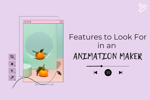
Animation
Animation can serve many purposes in a presentation. The following are just a few examples:
- Telling a story to boost the content’s overall persuasiveness
- Illustrating complex concepts and ideas
- Establishing a brand with animated characters who represent an organization’s branded “personality”
- Adding humor to a presentation, making it more entertaining (and thus more engaging)
Visual Storytelling
Even if you don’t incorporate animation into a presentation, you might nevertheless account for the current presentation design trend of visual storytelling when deciding how to hit certain essential points.
For example, perhaps you’re delivering a sales pitch. Your goal might be to illustrate how your products or services solve a common problem for your customers. One way to do so is through a series of pictures telling a story about a character who faces the same problem your customers face, only to overcome it with the help of your products.
A series of photos is just one potential visual storytelling strategy. For instance, if a comic is more brand-appropriate, you could include a comic instead of a photo series in your presentation.
Prioritizing Accessibility
Presentation design isn’t just about ensuring a presentation looks impressive. It’s also about ensuring as many audience members as possible can absorb the presentation’s content.
Ways to make a presentation more accessible include:
- Using captions during videos
- Including the option to turn on audio narration and descriptions for blind audience members
- Designing multiple versions of a presentation in different languages
- Avoiding excessive usage of cultural idioms and slang that might alienate or confuse audience members from different cultures
Large Blocks of Vibrant Text
Instead of including substantial amounts of relatively small text on individual presentation slides, consider using fewer words per slide but opting for larger font sizes and more vibrant colors. This is another way you can use text to capture the attention of audience members while still adhering to a relatively minimalist presentation design style.
Dark Mode
Many people already opt to use dark mode when viewing their phones and tablets in order to reduce eye strain. Website and app designers have taken note, making design choices that are compatible with dark mode, such as:
- Ensuring there’s a reasonably strong contrast between background and text/images
- Testing color choices in dark mode to confirm they still look pleasing
- Using dark gray instead of pure black
- Using off-white fonts instead of pure white fonts
This trend has also begun influencing presentation design. Keep it in mind when designing your slides.
A Return to Serif Fonts
Anything a person sees on a slide in one of your presentations can tell them something about your brand. As such, it’s important to remember that there are no color schemes, fonts, or other such elements that are ideal for all presentations. You need to be certain the visual aspects of a presentation correspond with your branded identity.
That said, Serif typography is making a comeback in presentation design. Because Serif fonts may appear somewhat traditional or old-fashioned, they’ve come to convey a sense of timeless authority.
Muted Images
Are you looking for a way to include more interesting images in your presentation slides without the slides looking too busy? If so, consider muting images so they blend in more with the background. This simple presentation design technique allows you to add more images while maintaining a clean sense of visual consistency.
AI-Generated Images
Thanks to AI programs, designers can now generate various types of images in just a few moments. As such, they’re experimenting with AI images, using AI to develop imagery that would normally take hours or even days to generate.
It’s not necessarily wise to use all the images that an AI program generates. These tools are simply giving presentation designers more creative freedom to experiment with imagery than ever before.
2023 Presentation Design Trends to Keep in Mind
Consider these presentation design ideas the next time you need to put together a visually-appealing presentation that’s both attractive and informative. By accounting for current trends and using the right tools, even someone with minimal design experience can create a presentation that resonates with audience members.
Create Gorgeous Presentations With Powtoon
Offering features such as text effects, animation, and much more, Powtoon is an online presentation maker that allows everyone from amateurs to seasoned pros to design presentations that impress. To learn more about what Powtoon can do for you, sign up today.

Hanna Abitbul
Latest posts by Hanna Abitbul (see all)
- What is Veo 3 and How Does It Work? - July 7, 2025
- Veo 3 vs. Sora by OpenAI: Side-by-Side Comparison for 2026 - June 26, 2025
- Veo 3 Cinematic Video Creation: Realism Without the Wait - June 25, 2025
- Veo 3 for Marketers: Creating Ads and Product Videos Faster with Powtoon - June 24, 2025