How to Optimize the Post-Click Experience with Video & More
Digital advertising technology has significantly advanced in recent years, enabling marketers to create, test, and optimize hundreds of personalized ads faster and easier than ever before. With many tools available today — from Google Dynamic Search Ads and Facebook Automated Ads, to email automation software and retargeting features — marketers can easily segment their audiences and deliver the best ads to the right people.
Even with all of these advertising options available across a wide variety of ad platforms, over 96% of paid ad clicks and more than 99% of display ad clicks still don’t convert.
This is a huge waste of budget in the multi-billion dollar digital advertising industry, and the main reason is that the post-click experience has not been a focused initiative in the market. The majority of digital advertisers spend most of their time on the pre-click experience (the ad) and fail to optimize the post-click experience.
What Is the Post-Click Experience?
The best way to define it is by comparing it to the pre-click.
The pre-click experience is everything that happens before a prospect clicks your ad. Many elements play into this stage and impact a prospect’s willingness to click. To name a few:
- Targeting
- Headlines
- Copy
- Colors
- Images
- Relevance
- Location
- Timing
The post-click experience, on the other hand, is everything that happens after a prospect clicks your ad which can impact their decision to convert on your offer:
- Page load time
- Message match consistency
- Skimmable text
- Usability
- Informational images
To address the fact that only a small fraction of ad clicks convert, it’s essential to know how to provide a true personalized experience for prospects while generating more conversions.
5 Elements of an Optimized Post-Click Experience for Success in 2019
Before we get into the 5 main elements of post-click optimization, let’s talk about page load speed for a moment. If your page doesn’t load fast enough — near instantly — visitors will likely bounce, never see your page, and the rest of the tips below are irrelevant.
A common solution to tackle slow page speed is AMP, the open-source framework introduced in 2015, which allows advertisers to create lightning-fast, smooth-loading mobile web pages that prioritize the user-experience above all else. AMP pages deliver near-instantaneous load times, while still supporting styling and branding customizability.
With fast page load speed as a requirement, let’s look at the five primary ways to optimize the post-click experience.
1. Message match consistency
Prospects click your ad expecting what follows to deliver the same offer and have the same message. This is called message match — coordinating your ad content to the post-click experience so visitors are certain they’re in the right place after clicking through.
You can create this consistency throughout your campaign by incorporating the same/similar headlines, aesthetic elements (fonts, colors, CTA buttons, etc.), visuals, and most importantly, the same overall message.
Akamai’s display ad matches closely to the corresponding post-click landing page:


They both include the same background graphic, similar copy, and company logo. They also have matching colors and promote the same exact offer.
With precise message match like this, the user experience remains consistent from start to finish and visitors are more likely to fulfill the post-click conversion goal. Without it, they may be confused, skeptical, and likely abandon the page.
2. White space
White space (aka negative space) is the empty space in between and around your page design elements. It helps provide visitors with a pleasing visual experience but also plays a vital role in persuading them to click your CTA button.
While this space doesn’t actually have to be white, it does have to help isolate and draw attention to important elements on your post-click page — headlines, images, forms, CTA buttons, etc.
Monday.com surrounded their headline, subheadline, and form/CTA button with ample white space to make it stand out on the left side of the page:
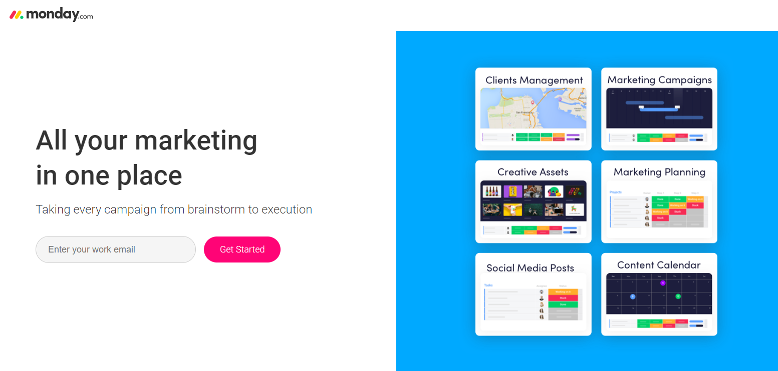
By surrounding these key elements with white space, they reduced clutter, improved readability, and effectively indicate to visitors what to focus on.
3. F or Z pattern
The order in which elements appear on your page is essential to generating conversions. You must consider the way visitors are likely to view your page and there are two proven ways they’ll do this: in an F-pattern or a Z-pattern.
The F-pattern mimics typical reading behavior:
- Visitors start in the upper left part of the page and read in a horizontal line across the top.
- Their gaze moves down the left side of the page and then reads in a second horizontal movement.
- Users finish by continuing down the left side of the page, moving to the right whenever content permits.
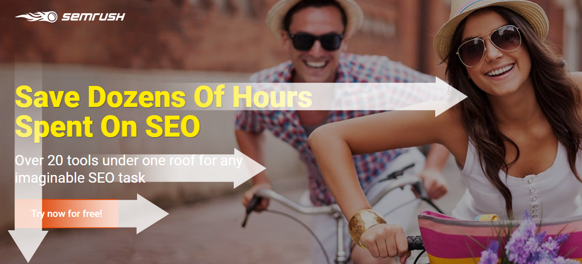
This SEMrush post-click page follows an F-pattern precisely:
The Z-pattern viewing method follows this order instead:
- Visitors start from the upper left corner of the page and scan across the top.
- Then they simultaneously look left and down in a diagonal path.
- Lastly, their gaze moves from left to right again in a horizontal line.
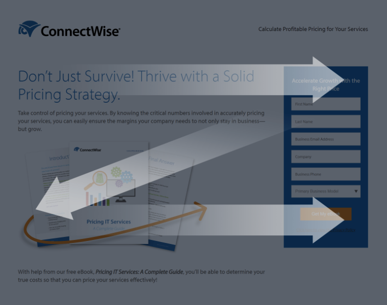
You can see the Z-pattern clearly on this ConnectWise page:
It’s worth mentioning that users don’t only look at the areas mentioned in this section; however, eye movement tends to be slower and more focused in these specific regions. You can use this knowledge to strategically place the most important elements — in the areas where your visitors are most likely to notice and focus on them.
4. Form length
Many marketers struggle to create their lead capture forms the correct length. This could lead to two different outcomes: too many fields could intimidate prospects, or too few fields and you will generate more MQLs than SQLs.
Form length should be based primarily on the marketing funnel stage of your offer. Generally, the further down the funnel, the more information you can request without scaring them off.
These basic guidelines can help determine how many fields to include:
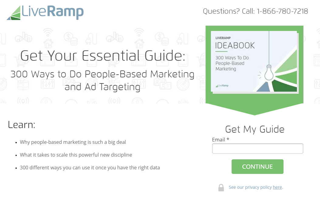
- Top of the funnel offers — often times, free resources like the LiveRamp guide below — don’t need many form fields because they’re intended to generate as many leads as possible:
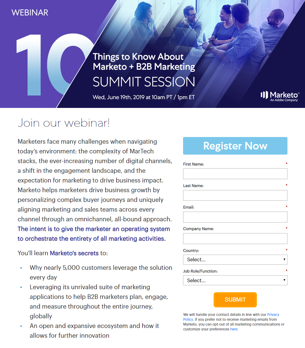
- Middle of the funnel offers like webinars, case studies, and free samples provide prospects with additional information, which means you can request more information from them as well.
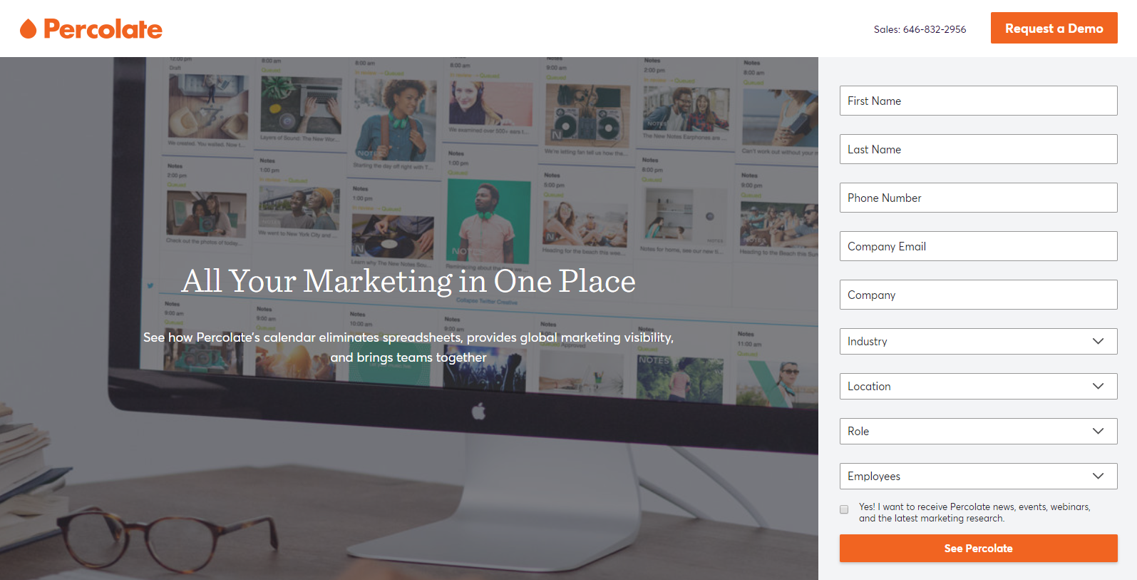
- Bottom of the funnel offers are for leads in the decision-making stage who are in the market to buy now. Brands can get away with longer forms in this stage, for offers like free consultations or product demos, like Percolate does here:
No matter what funnel stage your offer lies, consider using a multi-step form if you require a lot of lead information. This breaks up your form into smaller sections so the visitor isn’t overwhelmed by a single lengthy form on the page.
5. Video
With the average user attention span at only 8 seconds, adding video to your post-click experience has the potential to better engage your visitors since they’re not forced to read lines of copy. In fact, post-click landing page videos can increase your total conversions by as much as 86%.
When adding video to your post-click optimization strategy, keep these tips in mind:
- No autoplay — Give visitors the chance to digest your information at their own control (by pressing play) and not annoying them with an autoplay video.
- Accentuate it — Rather than making it blend in with all of your other post-click elements, be sure it stands out so visitors can’t resist playing it.
- Animation vs. live action — Animated videos tend to be the better option for abstract products or services, as a way to simplify complex topics in an engaging way. Live action is usually better if your goal is to humanize your brand.
- Aim for high-quality — Keep it professional by using a high-quality camera, writing out a proper script with no awkward pauses or breaks in the voice over, hiring a designer for graphics, etc.
- Keep it short — One of the main points of the video is to explain your offer faster than copy, so as a general rule of thumb, keep it under 2 minutes.
- Add a CTA — Calls to action aren’t just for page copy, but also serve well at the end of a video to tell viewers what steps to take next.
This SharpSpring page features a video that implements all of these tips:
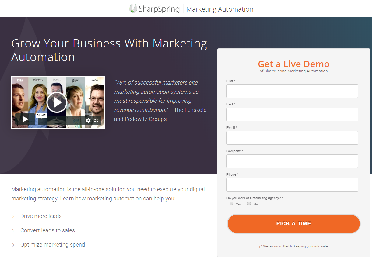
- It allows the visitor to play it on their own
- It’s above the fold so it’s noticeable immediately
- The 1 minute and 43 seconds duration is not too long
- It is high-quality and professionally designed
If you feel you don’t have the budget to create a post-click video — or think that a video may distract from your main message — you can also opt for a GIF instead of a video. Gifs are especially ideal to play on a loop and demonstrate how your product is used.
Set Yourself Up for Success by Optimizing the Post-Click Experience
Optimizing the pre-click stage is crucial, but no campaign is complete without post-click optimization as well. With these design best practices — message match, white space, an intentional layout, correct form length, and of course, video — you can create optimized post-click pages for each campaign. Your conversion rates with thank you in no time.
About the Author

Tyson Quick is the Founder and CEO of Instapage, the leader in post-click automation. He founded Instapage in 2012 after seeing how performance and growth marketers were losing money in underperforming advertising campaigns. Since then his vision has been to create a suite of post-click automation products that maximize returns through advertising personalization.
Guest Author
Latest posts by Guest Author (see all)
- 4 Tips for Video Learning After COVID-19 – and 1 Huge Mistake to Avoid - May 21, 2020
- How to Optimize the Post-Click Experience with Video & More - July 15, 2019
- Video CRO: 6 Tips for Using Video to Boost Conversions [Guest Post] - February 21, 2019
- How Small Businesses Use Video Marketing To Promote Their Brand - January 1, 2014